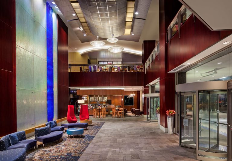
Our society tends to view differences as a problem, believing that connection and alignment require a 100% match. We see the same concept demonstrated in interior design when matches colour palettes to the extent that the atmosphere becomes monochromatic. Spaces are designed this way can lead people to more readily believe that they need to be identical in order to get along, rather than being able to harmoniously connect with those who are different: the ‘match’ in the space makes anything contrasting seem like a misfit. The atmosphere does not support integrated individual expression.
Feng Shui speaks to the Five Elements that make up all physical matter: Fire, Earth, Metal, Water, and Wood. While there are various combinations that are more supportive than others, the entire cycle coexists harmoniously. While Water and Fire have an opposing relationship (water puts out fire), there is an excitement that gets created when black and red colours are combined in design. However, if they are not offset with the other elements, the contrast builds into antagonism and division; bringing metals, earthy tones, and lush greenery helps the two opposing elements find their common ground and connect to the greater nourishment that they all provide and receive from one another.

Image via Restoration Hardware
I’ve found a bit disconcerting the level to which many high-end chains and designers emphasize a ‘neutral’ palette with very little contrast or colour. One unintended consequence of this approach is emotional flatlining, where the highs and lows are cut in favour of perceived ‘safety’. It is remarkably difficult to find images in design magazines or online that show spaces designed with more than two elements balanced throughout the space without a garish blend of colours resembling a Rubik’s Cube. Isn’t it interesting that our society is simultaneously having a challenge with finding harmonious connection between people of opposing viewpoints.
When spaces are tastefully balanced with the Five Elements, as well as with Yin and Yang polarities (dark-light, low-high, curved-angular, and so on), the environment becomes a space that incubates the harmonious interplay of seemingly opposing factors. That which is different can peacefully coexist with and in fact be a much-needed complement: what connects is more important than what differs, and each supports the other.
A case in point: a university administrator attending a presentation I was giving to designers, architects, and space custodians spoke to a successful classroom design that incorporated seating with multiple colours. He stated that students would go to class early to choose a seat in their preferred colour. I noted that the varied colour palette provided choice and allowed them to highlight their individuality in conjunction with the space, when academic environments can often leave students feeling anonymous and lacking in choice. The fact that these students wanted to show up early for class speaks volumes to how the integrated design made them feel welcome and encouraged more engaging and engaged behaviour – how often do students generally choose to show up early for class?

Guildford Town Centre by MCM Interiors Ltd.
Like everything in life (and feng shui), it’s about balance. Applying these principles does not mean you can’t have a colour scheme that highlights two elements to make a statement – but within that framework, providing balance with other elements brings even more life to the space. Just like some environments are hot and others are cold, some are lush and others are more arid, each space can have its flavour and atmosphere … but when the full cycle of natural balance is present contextually, the space is integrated beyond the immediate ‘statement’. This integrity supports connectivity, ease, and alignment amongst those who are present.
Cover image of Hyatt Vancouver by MCM Interiors Ltd.


Recent Comments